


Ornamental Fancies II, 2019, acrylic on turned posts, 120 x 80 x 40 cm

Ornamental Fancies, installation view. Photo: Docqment

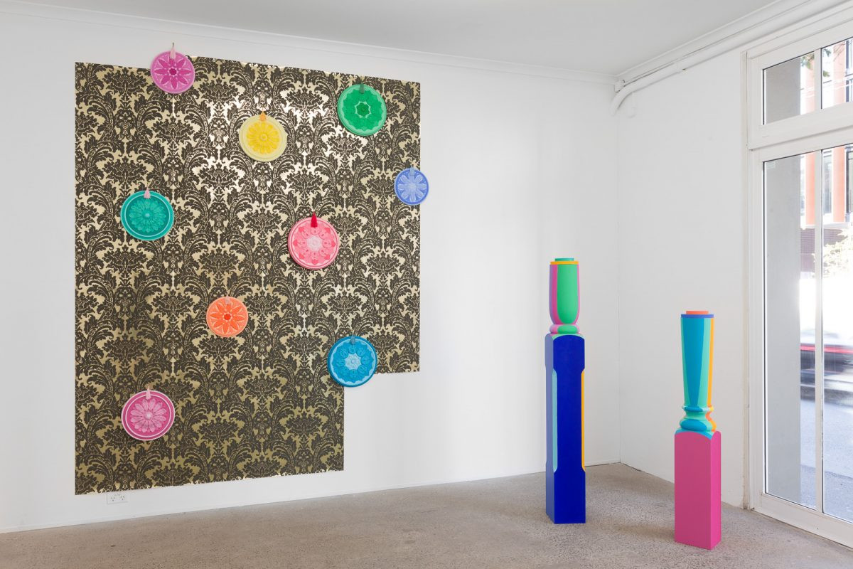

Ornamental Fancies, installation view. Photo: Docqment
Antipodean formalism and post-pop
For Nuha Saad the mix of Sydney formalism, colonial architectural details, and the post-pop colours of a commodity driven culture is informed by multicultural discourse. The flavour of antipodean formalism is confronted in a direct way and democratised by the play of colour on object, and the repurposing of found materials. Saad inherited the high design principles of De Stijl and the Bauhaus, the logic of the Fibonacci series, but the decoration of the iconoclast has been turned in the service of community meeting points, parks and school yard playgrounds in a vast array of Public works and sculptures.
The federation colours of stale blue and green are surpassed by a post pop palette of tangerine and purple, reflecting the myriad forms of commodification in twenty-first century design. Cerise and teal feature prominently. Colour is used to not only highlight the overlooked spaces of urban architecture, to hide and diminish its drab concrete and steel façade but to humanise its scale, and render the surfaces playful. It is not ironic that Saad’s public works are linked thematically and in terms of colour to the interior works, playing off a range of traditional home decoration motifs and objects which have been given an afterlife by the consistent use of colour; the tired balustrades, flocked wallpaper, and ornate plaster ceiling roses, that adorn federation houses, are embellished further turning the formal logic from minimalism and pop of repetition and pattern into a cascade of varied colours which are hypnotic and disarming, an assemblage of fruitiness and optimism. Stripes and patterns dance across surfaces and diminish the authority of whole object as it splinters into a mesmerising range of colours and combinations.
Saad’s installations of objects seek to confuse and destabilise the viewer, as they merge op-colour combinations and flocked textured wallpaper designs in a maddening way, demonstrating that meaning can be complex, dependant on the position of the viewer/subject. The work is engaged in minimalist strategies that have become accepted in sculptural language. A piece of wood leant against a wall will activate the wall, the floor and the space around it. Causing a phenomenological reading that draws on one’s sense of clumsiness and overload. The minimalist designer ethos that fills home beautiful magazines targeted at a white middle class audience seems vacuous and empty by comparison. Saad performs this critical and crucial flip by juxtaposing the position of each element; the clashing textures and colours, the ceiling rose on the wall and the wallpaper on the floor, which insist on another all-together more complex idea of the ideal home, closer to reflecting actual homes with overlapping styles and personal tastes. Saad alludes reflexively to a new era for the expression of post-colonial discourses by highlighting marginalised and overlooked spaces and objects, which is positive, complete and optimistic.
Michele Beevors
Principal Lecturer: Sculpture and Ceramics
Dunedin School of Art Otago Polytechnic
Photos: Docqment


